


The Feed 2.0: This time it’s optimised
What does one do with 240 articles – written for magazine editorials – dumped on a company’s unfindable ‘blog’?
One embarks on a complete re-design of the content hub.
The (many) problems
Content was a mess
The rebuild of mebank.com.au, finally gave us the CMS capability to author and manage a content hub.
But the content was not up to scratch. We were embarrassed to distribute it, and it certainly wasn’t being found organically.
Much of it was out of date, un-findable, and not readable.
3. Reliance on product and rate-led marketing
Marketing with rates alone can be tiresome. Financial education has such a valuable impact on customers. We wanted to solve people’s problems using our financial expertise, not promote Term Deposit rates all the time.
We decided to educate and empower instead so we had an alternative to interruption-based product marketing.
2. Financial literacy lacking in Australians
Research shows financial literacy and financial capability are key markers on life satisfaction. Financial anxiety and monetary stress impact on many life factors – like retirement comfort, savings, and satisfaction with ones financial situation (an important predictor of well-being).
Combining HILDA’s 2019 report finding that 55% of Adults in Australia aren’t financially literate, with ME’s purpose of ‘Helping Australians get ahead’, surfaced us the key need for financial education content.
4. Customers weren’t getting educational content
Our customer base wasn’t receiving any information from ME on how to manage their money.
We solely communicated service outages, and rate changes. No emotional or value-based connection was made to our most important customers – the ones we have – leaving ME vulnerable for customers switching.
The project
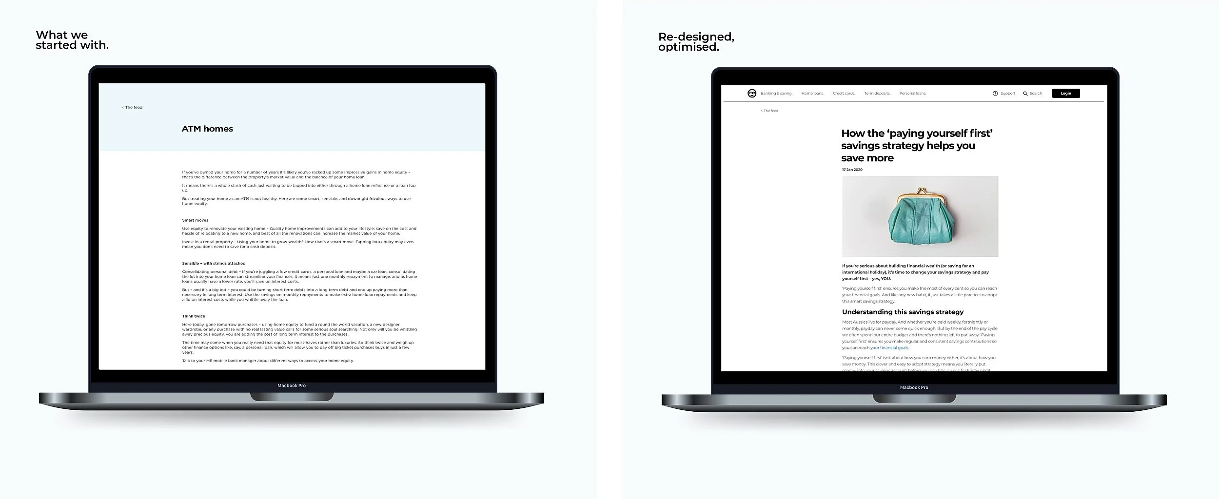
The before
Our content had no styling, imagery, or formatting.
It wasn’t optimised for digital consumption.
No taxonomy organised the categories, nor was the UX friendly to browse or intuitive to find.
Content wasn’t WCAG 2.1 compliant, scannable, or accessible.
No-one understood the value or topics due to wacky, brandy headlines.
Very ‘ME focused language’ and ‘tips’ with product heavy content.
The after
The UX uplift and Content redesign gave us the ability to:
Categorise and tag, organising topics
Format and style, include rich media and lists
Optimise for SEO with schema tags and improve accessibility
Create engaging rich content with GIFS, video, imagery and quotes
Apply conversion and strategic components for product acquisition
Create sub-topic aggregators for targeted customer journeys
We made our content accessible, scannable, easier to navigate, and more engaging to read.
Analyse and audit
Performed content analysis
Competitor research
Content audit
Removed duplicates and underperforming content
Design architecture
Worked with UX Designer and Product Owner to define page templates and requirements
Designed taxonomy and content hierarchy with categories and tags
Create content
Re-wrote 120 best performing and most relevant articles
Introduced imagery, styling, formatting, meta tagging
Created topic based product journeys
Optimise and refine
Implemented content reporting
Set benchmarks for performance
Defined quarterly review cadence
Optimised underperforming content

Using empathy mapping and research enabled us to dig deeper into what our customer’s needed and valued. We then wrote content directly to those needs and values.
Image: Empathy mapping for two common savings behaviours.
The results
Traffic grew
By optimising content for search, and embedding content into marketing or service experiences, we significantly increased visitors to www.mebank.com.au.
Traffic to /the-feed increased 190% the year after the relaunch, from 89k unique visitors to 202k.
We optimised and grew further, by another 29% from 202k visitors to 261k the following year.
Quality engagement and goals increased
Increased session duration across all pages under /thefeed by av. 30 seconds, to 1m 58s
Increased goal completions (account applications) by 235% the first year post re-launch
Organic search improved
Increased organic sessions by 11% in the 1 year post re-launch
Consistently rank highly for search terms surrounding topics:
Savings buckets
Auctions
Budgeting tips
Refinancing
First home buying
This was the first time using an iterative UX process for content at ME Bank.
A optimisation cadence and roadmap was generated out of the content strategy work.
Often, organising an existing mess is harder than starting again. So we implemented a content framework, artefacts and standards for all future information.

The team
Digital Content Lead: Bec Thexton
Digital Channel Specialist: Jason De Luca
Website Product Owner: Ben Hallinan
Experience Designer: Emma Young-Wright
Copywriter: Anna Spargo-Ryan
Brand Designer: Frances Gray